- A SKEPTIC's GUIDE - A SKEPTIC's GUIDE
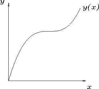
 In Physics we often prefer the image of the GRAPH, because the easiest way to compare data with a theoretical function in a holistic manner is to plot both on a common graph. (The right hemisphere is best at holistic perception, so we go right in through the visual cortex.) Fortunately, the issue of whether a graph or an equation is "better" is entirely subjective, because for every function there is a graph - although sometimes the interesting features are only obvious when small regions are blown up, or when one or the other variable is plotted on a logarithmic scale, or suchlike.
Nevertheless, this process of translating
between left and right hemispheres has far-reaching significance
to the practice of Physics. When we draw a graph,
we cathect the pattern recognition skills of our
visual cortex, a large region of the brain devoted mainly
to forming conceptual models of the "meaning" of visual
stimuli arriving through the optic nerve. This is the
part that learned to tell the difference between a leaf
fluttering in the breeze and the tip of a leopard's tail
flicking in anticipation; it performs such pattern recognition
without our conscious intervention, and thus falls into
the "intuitive" realm of mental functions.
It is fantastically powerful, yet not entirely reliable
(recall the many sorts of "optical illusions" you have seen).
The mere fact that many (not all) physicists like to display their results in graphical form offers a hint of our preferred procedure for hypothesis formation (Karl Popper's conjectures). Namely, the data are "massaged" [not the same as "fudged" - massaging is strictly legitimate and all the steps are required to be explained clearly] until they can be plotted on a graph in a form that "speaks for itself" - i.e. that excites the strongest pattern-recognition circuit in the part of our visual cortex that we use on science - namely, the straight line. Then the author/speaker can enlist the collaboration of the audience in forming the hypothesis that there is a linear relationship between the two "massaged" variables.
For a simple example, imagine that a force F actually
varies inversely with the square of distance r:
F(r) = k/r2
with k some appropriate constant.
A graph of measured values of
F vs. r will not be very informative
to the eye except to show that, yes, F sure gets smaller
fast as r increases. But if the ingenious experimenter
discovers (by hook or by crook) that a plot of
F vs. 1/r2
(or 1/F vs. r2 or
![]() vs. 1/r or . . . ) comes out looking
like a straight line, you can be sure that the data
will be presented in that form in the ensuing talk or paper.
The rigourous validity of this technique may be
questionable, but it works great.
vs. 1/r or . . . ) comes out looking
like a straight line, you can be sure that the data
will be presented in that form in the ensuing talk or paper.
The rigourous validity of this technique may be
questionable, but it works great.